Easy Warhol Pop Art Project

Our first graders just completed an Andy Warhol-inspired project in their general ed classroom. After reading Getting to Know Andy Warhol, they drew a single common object. In past years, their teacher would take the drawings to the copy machine, reduce them and make four images of each child’s art. The children would then color the copies. This year I consulted with the first grade teacher about how to use iPads to simplify the process. We ended up with two options using the iPad camera and two free apps: PicCollage and Pop Art Lite.

Pop Art Lite does only one thing: turn artwork into 4-part Warhol grids. I like Pop Art lite because you can change the color scheme. Warm, cool, complementary, analogous are choices you can make.


For PicCollage, kids take a photo of their drawing with the iPad, then put that photo in each quadrant of a grid. You can adjust the filter color, or print out the PicCollage and then hand color it. Getting To Know DVDs – $29.95 from: Blick Art Materials (compensated affiliate link)
 

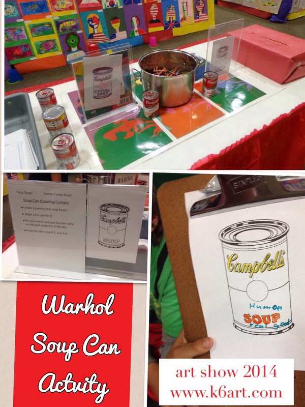
We used this Warhol soup can template from the E is for Explore blog during our art show.  I read that Warhol used a ‘semi-mechanized’ method for creating his soup cans – I figure a copy machine is also semi mechanized.  Here are the results.

Our interactive coloring contest ties in to the FEAST! unit.

Our interactive coloring contest ties in to the FEAST! unit.

Animated Name Art

I tried out Scratch, the free kid-friendly coding website from MIT. The website has great step by step directions for creating animated name art using drag and drop commands. It took me a little while to get the hang of it, but soon I was able to get my letters to make sounds, change colors, bounce and rotate. Scratch provides ready-made letters, or you can draw your own. You can also upload your own files for the background or for individual letters.

Here’s my attempt. For letter ‘I’, I found an image of the Chrysler Building and erased the background. (Please note – this animation requires Flash and cannot be viewed on iPads).

I liked Scratch a lot. There are tons of student-made name art examples to inspire you. Scratch lets you look at the code (‘script’) inside everyone’s creations. You can even remix other folk’s creations.

Scratch requires Flash – unfortunately you can’t use it with iPads.

Enjoy!

Roy Lichtenstein Art Project for iPad and Computer

Our 6th graders did another digital art project this week: a quick artwork inspired by pop artist Roy Lichtenstein. We used iPads, but the good news is you can do this project from a computer just as easily.

20140501-094320.jpg

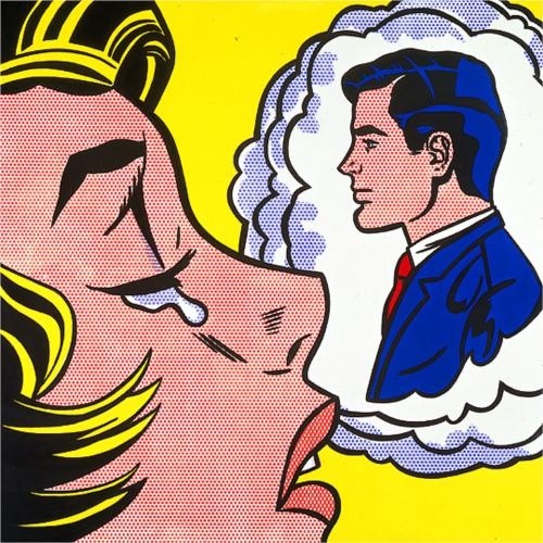
Lichtenstein’s Thinking of Him, 1963.

After looking at Lichtenstein’s 1963 painting Thinking of Him, students used their iPads to do a Google search for Lichtenstein images. They saved their five favorites to the camera roll.
I asked what they noticed about Lichtenstein’s work. Students noticed word bubbles, a lot of blonds and cartoons. I asked them to review their saved images and look for

  • everyday items
  • primary colors (red/yellow/blue)
  • black outlines
  • dots, especially for flesh tone

We talked about appropriation in art. During the 1960s, Lichtenstein and other pop artists such as Andy Warhol used pre-existing images of everyday objects (i.e. comics) as a starting points in their artworks. I passed out enlargements from old newspaper comics, plus the little wax paper primary color comics from Bazooka bubblegum.  I explained that these types of images were well-known back in the early 1960s. Even the dots (known as ‘benday’ dots) Lichtenstein used were appropriated from comic book printing techniques used back in the 1960s.

The digital Art Project
We used the free, online TATE kids dotshop website to create our digital artworks. (note: dotshop is compatible with iPad and computer).

How to create a digital Lichtenstein-inspired portrait using TATE kids DotShop.

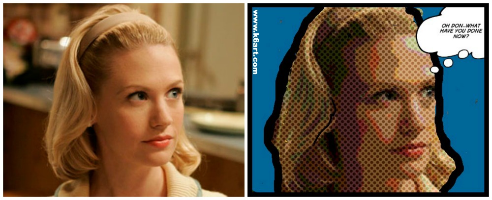
Create a digital Lichtenstein-inspired portrait using TATE kids DotShop. Teacher example. Betty Draper photo via AMC

Steps to create a Lichtenstein-inspired digital artwork:

1.Open TATE Kids

2. a) use the camera option to take a selfie or picture of your friends or b) appropriate a well-known image from the internet (e.g. Betty Draper, Sponge Bob, Arnold Schwartzenegger).

3. Adjust color and benday dot size.

4. Color in the background a solid color

5. optional: outline in black

6. optional: add text.

7 Save within the website, then save to camera roll.

8. Turn in to digital turn in folder on Google Drive (click here to read about how we turn in digital art).

6th grade results 

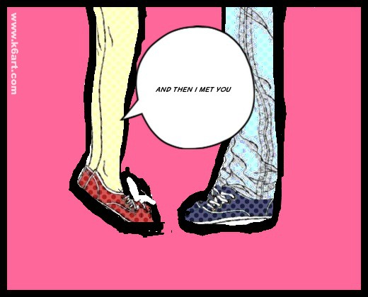
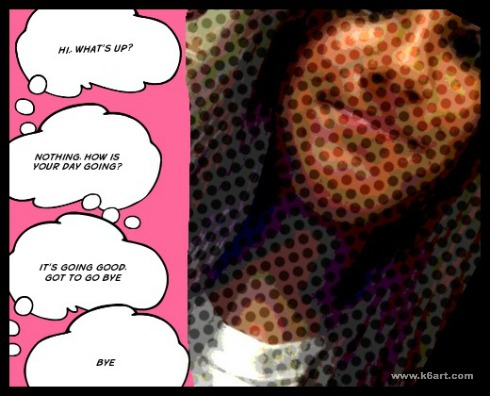
Kenna's appropriated image, includes dots, pink background and text.

Kenna’s appropriated image, includes dots, pink background and text.


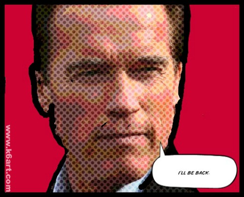
Appropriating an image: Lucas found an image of Arnold Schwarzenegger, added benday dots, colored the background red, and added text.

Appropriating an image: Lucas found an image of Arnold Schwarzenegger, added benday dots, colored the background red, and added text.

DotShop Lichtenstein-inspired self portrait

Enjoy!


Do you have a favorite Lichtenstein-inspired art project?


iPad Blended Self-Portrait


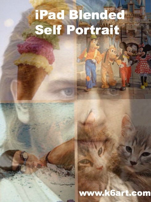
iPad blended self portrait

Our 6th grade did some quick blended self portraits using their iPads and two free apps: Pic Collage and Sketchbook X. The goal of the lesson was to learn the layers, free transform and opacity tools in Sketchbook X.

Obi-wan's favorite pet, vacation, activity and food are combined into a layered self portrait.

Obi-wan’s favorite pet, vacation, activity and food are combined into a blended self portrait. Allow one 40-minute class.

Step 1: Pic Collage App: create a photo collage of your favorite things

Students had to find four images representing

  • a pet (or dream pet)
  • favorite vacation (or dream vacation)
  • favorite food and
  • favorite activity or sport

The Pic Collage app allows students to add photos directly from the web without a Google image search. The students arranged them in a grid template, then saved to the iPad camera roll.

Step 2: Sketchbook X App: working with layers and free transform

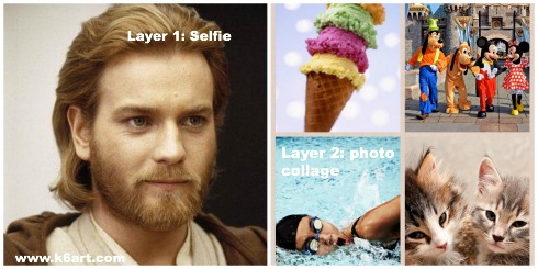
In Sketchbook X, students created two layers. Layer one was used to shoot a selfie, and layer two was used to import the photo collage from the camera roll. For many students it was necessary to use the free transform tool to resize the photos to fill the screen. .

Step 3: Sketchbook X app: Adjust the opacity to reveal the blended self portrait

Students used the opacity slider in the first layer to reduce opacity and reveal the photo collage layer underneath.

I create a 10 minute video tutorial of the process.

https://www.youtube.com/watch?v=f7U1AbiahXA

Students saved their completed portraits to their camera roll, then turned them in to me electronically via Google drive.  Click here to read about how students turn in digital art.

Notes:

  •  Instead of finding photos on Google image, use students’ personal pet and vacation photos. Students could bring them to class as printed photos, or digitally via Google drive.
  • Want to skip Sketchbook X? Combine your photos with free photo blending apps, such as  iBlendy2 or Photoblend.
  • Video tutorial recorded with the AirServer app for Mac.

Enjoy!

Flipped Art Room – What I Learned at NAEA14

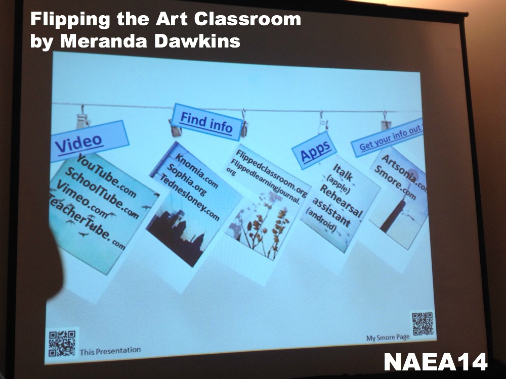
One of the best sessions I attended at NAEA14 had to be Meranda Dawkins ‘Flipping the Art Classroom’. Not familiar with flipped classrooms? Essentially, the teacher creates a video lesson which is viewed by the students at home. The next day, students come to school and do the assignment.

Meranda creates her own instructional videos and  does a ‘modified’ flipped art room: although she sends the lesson link home, she shows the videos at the beginning of class. After viewing, Meranda puts the video on mute and loops it during the rest of class.

This is great way to catch up a kid who was absent, or to help kids who don’t pay attention very well. It also benefits the art teacher who teaches the same lesson to multiple classes: you won’t leave anything out no matter how many classes you teach.

flipping the art classroom by meranda dawkins

Slide from Meranda Dawkins NAEA14 session. Scan the QR code at lower right to see all of Meranda’s lessons on smore.com

The big eye-opener for me was Meranda’s use of Smore to organize and send out her lessons. Smore.com is an online flyer design website.  I thought Smores were just a way to put out cute classroom newsletters. Not true! Meranda embedded images of Degas, a vocabulary check list and two instructional videos in this Smore.

Enjoy!

Have you ever flipped a lesson?

Related Posts Plugin for WordPress, Blogger...