Thiebaud “Cakes” Mural (and more!)

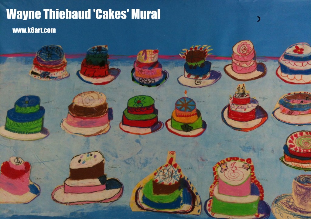
This is a universal truth:  kids love dessert.  Second grade recently completed their Wayne Thiebaud group art mural based on Thiebaud’s famous artwork, “Cakes”.

We began with my Wayne Thiebaud Powerpoint. We discussed repetition of simple shapes, variety, use of thick paint, horizon line and shadow. This year we also discussed halation – the vibrant lines of color Thiebaud uses to outline his work. If you are unfamiliar with halation read this excellent Thiebaud post on Art for Small Hands.

Next we watched a great 7-minute long Thiebaud video from CBS this Morning.  Here is the link.

Materials:

  • Drawing paper, 9″x12″
  • pencil and eraser
  • oil pastels
  • scissors
  • glue stick
  • bulletin board paper (allow 5 foot length for 22 students)
  • tempera

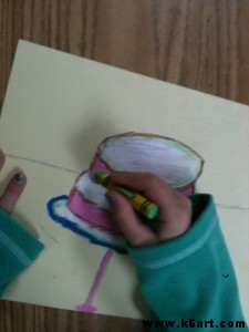
Students drew the basic cylinder cake first in pencil, then in oil pastel. We outlined in bright colors.  Because we were making a mural, for consistency students added purple shadows on the right side of their art.

The kids had a fabulous time ‘decorating’ their cakes, again with oil pastel. We had a ‘no words’ rule, but numbers were OK.

Students outline their cakes with vibrant colors

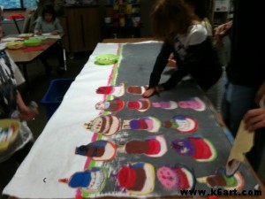
Students cut out their cakes and covered the backs with glue stick.  I arranged the cakes on painted bulletin board roll paper.

Assembling the mural

I made two murals: a 9 foot mural for 45 cakes, and a 5 foot mural for 22 cakes.  Next year I will make one 5-foot mural per class as the big one was beautiful but too unwieldy.

After the art show I will cut apart the mural. The second graders will trim and mount their cakes onto 12″x18″construction paper.

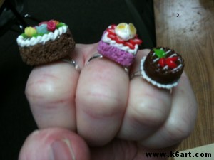
The perfect jewelry for any Thiebaud lesson 🙂

Have fun!

P.S. Want to try a digital Thibaud art activity? Try the National Gallery of Art’s

Thiebaud ‘cake maker’ interactive

UPDATE: NEW! Click here for my new lesson, Wayne Thiebaud Geometric Desserts. New video and Common Core connections.

 

Cool Color Monet Water Lilies

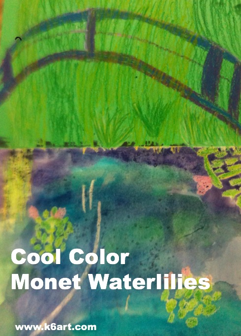
cool color monet waterlilies

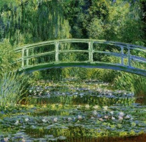
Second grade is studying the cool colors.  After watching the excellent elementary color theory DVD Getting to Know Color in Art  we looked at photos of Monet’s beautiful garden and pond in Giverny, France. Students could imagine themselves at the pond on a summer day, feeling the willows sway, listening to frogs as they rested on the lily pads, resting in the cool shade, even floating in Monsieur Monet’s ‘art boat’ as it passed under the Japanese bridge.

“Le Bassin aux nymphéas” 1899. One Monet’s many water-lily paintings.

We looked at several of Monet’s waterlily paintings, focusing on his use of cool colors and short, quick strokes of paint. You can download my Powerpoint of Monet’s garden here.

We then created an oil pastel and watercolor art work.

Allow three 40-minute sessions for this project.

Materials:

  • 12×18 construction green construction paper
  • 9×12 watercolor paper
  • glue sticks
  • oil pastels in blues, greens, and purples plus white, yellow and pink
  • watercolors in blue, green and purple
  • kosher salt (optional)

Discuss Monet’s art, his pond and garden. Review cool colors. View powerpoint or photos of Monet’s garden.

Fold green construction paper ‘hamburger’ (the short way). Glue watercolor paper to lower half of green paper.

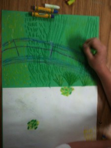
Students use oil pastel to draw bridge, water lilies and foliage.

Review painting of pond and Japanese bridge.

Oil Pastel:

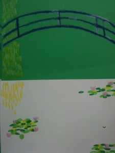
Using oil purple and blue oil pastels, draw three arcs (‘rainbows’) for the Japanese bridge. Add some vertical lines to the bridge to finish. Blend and highlight with white oil pastels.

Review photos of water lilies.

Using various green and yellow oil pastels, draw clusters of lily pads on the watercolor paper. The lily pads don’t have to be perfect – just ovals or quick strokes of pastel. They should overlap a bit. Add a few pink lily flowers, highlight with white.

Fill the entire top half of the green paper with foliage in greens and yellow. Use short strokes. Add a downward cascade of short lines for the weeping willow.  Tell kids to ‘go behind’ the Japanese bridge.

Use short strokes of oil pastel to completely fill the green paper with foliage.

Painting:

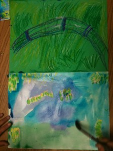
Using the cool colors (blue, green and purple), paint the watercolor paper using long horizontal strokes.  Colors can overlap and blend.  Go right over the oil pastel lily pads.

Use purple, blue and green watercolors on the lower half of artwork

Students may add a small pinch of Kosher salt to the wet watercolor. The salt absorbs a bit of color and an additional dimension to the pond. Brush off salt when dry.

Wow!!! This project was a hit! We learned about a famous artist, reinforced color theory, experienced the joy of painting on watercolor paper and blending pastels. All kids were very proud of their artwork. Success!


Enjoy!


(Note: post updated 12/22/13)

Related Posts Plugin for WordPress, Blogger...