Mixing Greens


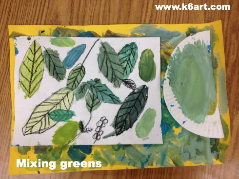
Students used tempera paint to create many shades of green.

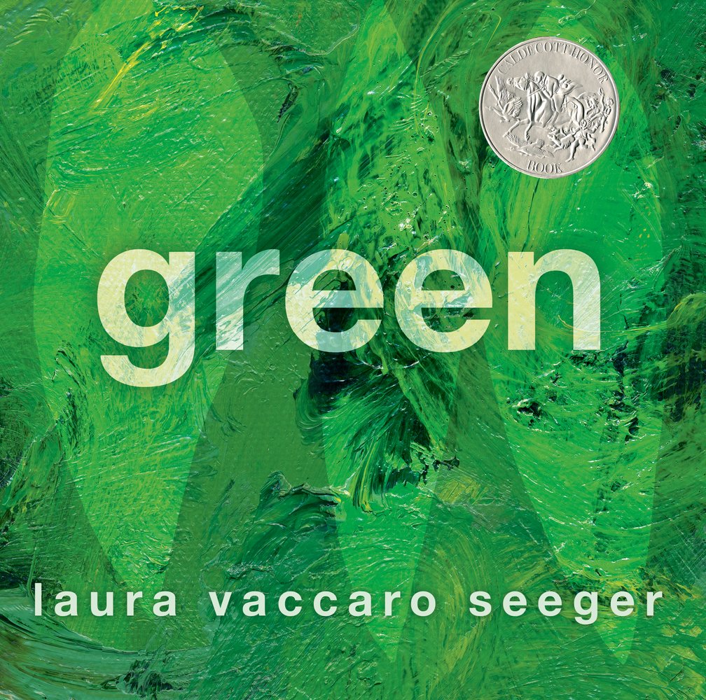
I received the book Green by Laura Vaccaro Seeger as a gift from a parent. This beautiful book (it won the Caldecott Honor in 2013) is filled with all things green.  It is the perfect tie-in to a color mixing lesson.

Green by Laura Vaccaro Seeger

Green by Laura Vaccaro Seeger, winner of the 2013 Caldecott Honor.

I read Green to my second grade art students.  They loved it – the book is full of die-cut holes and the kids enjoyed peeking through them. Can you see the die-cut holes in this video?

Materials:

  • white sulfite drawing paper (or other paper that will hold up to painting)
  • black crayons
  • paper placemats (we used 12″x18″ construction paper)
  • brushes
  • paper plates
  • tempera paint: blue and/or turquoise, yellow, black and white
  • black construction paper for mounting
  • scissors
  • glue sticks
  • colored construction paper (to create jungle animal collage)
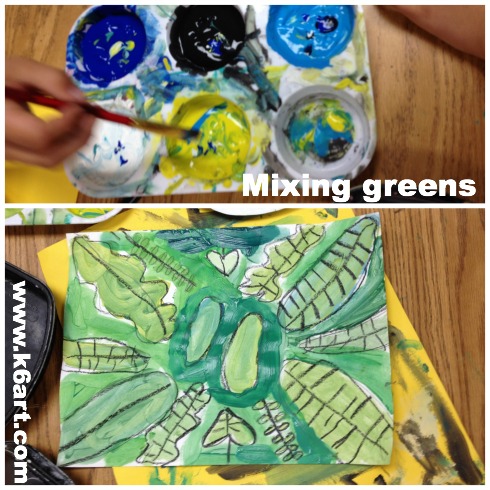
Second graders used blue, turquoise, yellow, black and white tempera to mix shades of green.

Second graders used blue, turquoise, yellow, black and white tempera to mix shades of green.

Mixing greens

After reading the book, we got to work creating our own jungle. Students began by drawing a variety of leaves on their paper. They added veins and stems. They placed their white paper onto the construction paper placemats. Next, they scooped up a small amount of yellow paint onto their paper plates. They added dots of blue paint and mixed to create green, then painted a leaf.

The students experimented – adding white to create tints and black to create shades. Students were excited to create army green and blue-green. Seriously – they called each other over when they created cool new colors. They loved color mixing so much we had to do it a second session.

We did not use water for this project. The goal was to mix a wide variety of greens. If necessary, they brushed excess paint onto their placemats.

Create a jungle collage

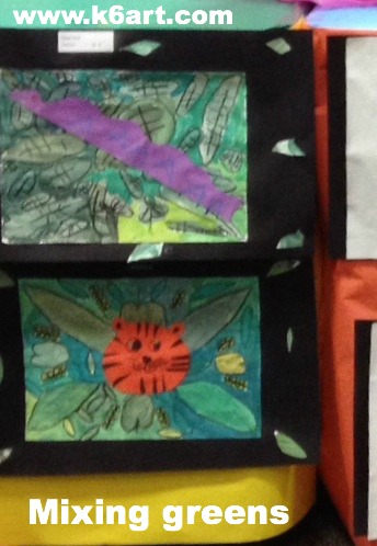
After the paints dried, we mounted the paintings on black construction paper. Students cut leaves out of their painted paper plates and used them to decorate the corners or create a border. Then they constructed jungle animals from colored paper and glued them on  top of the paintings.

mixing greens - jungle collage

This was a very successful lesson plan! The students enjoyed color mixing so much we could have done it for weeks.

Enjoy!

p.s. the project would be nice as an Henri Rousseau lesson plan.

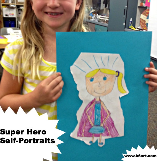
Super Hero Self-Portraits

super hero pinableLook! Up in the sky! It’s a bird….it’s a plane….no – it’s a second grader!

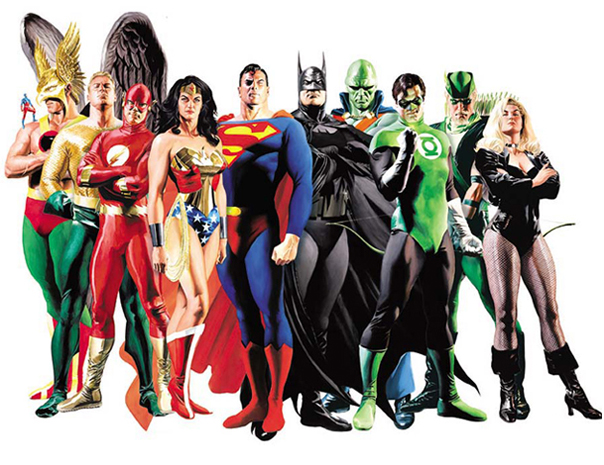
Second graders had a blast drawing themselves as super heroes. We began by looking at pictures of super heroes:

SuperHeroes1

After looking carefully, we noticed the super heroes had certain features. Many had:

  • symbol or letter on chest
  • belt
  • tools
  • mask
  • cape or wings
  • boots

We talked about how the super heroes had super powers that ordinary people did not have, and that they used these powers to help others.

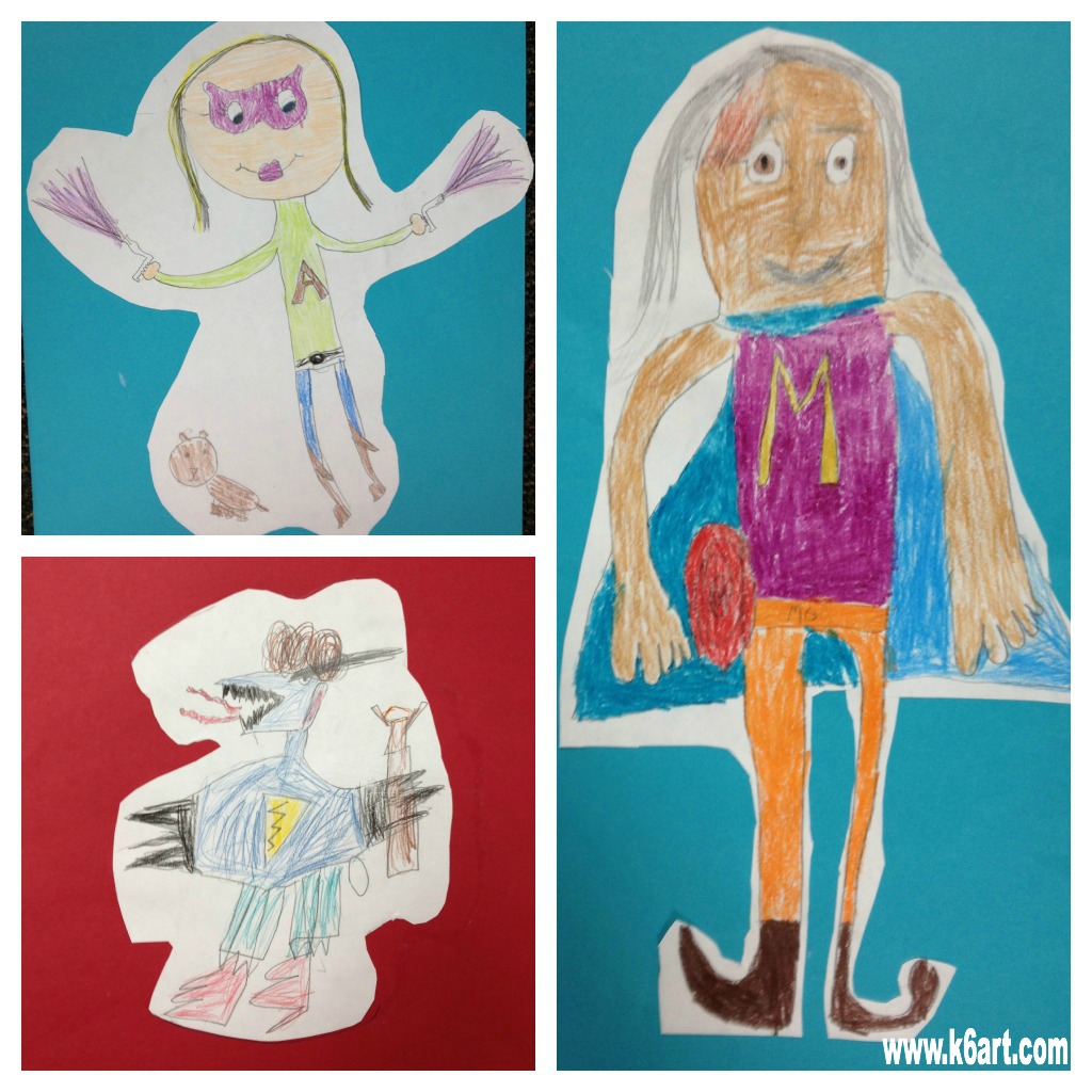
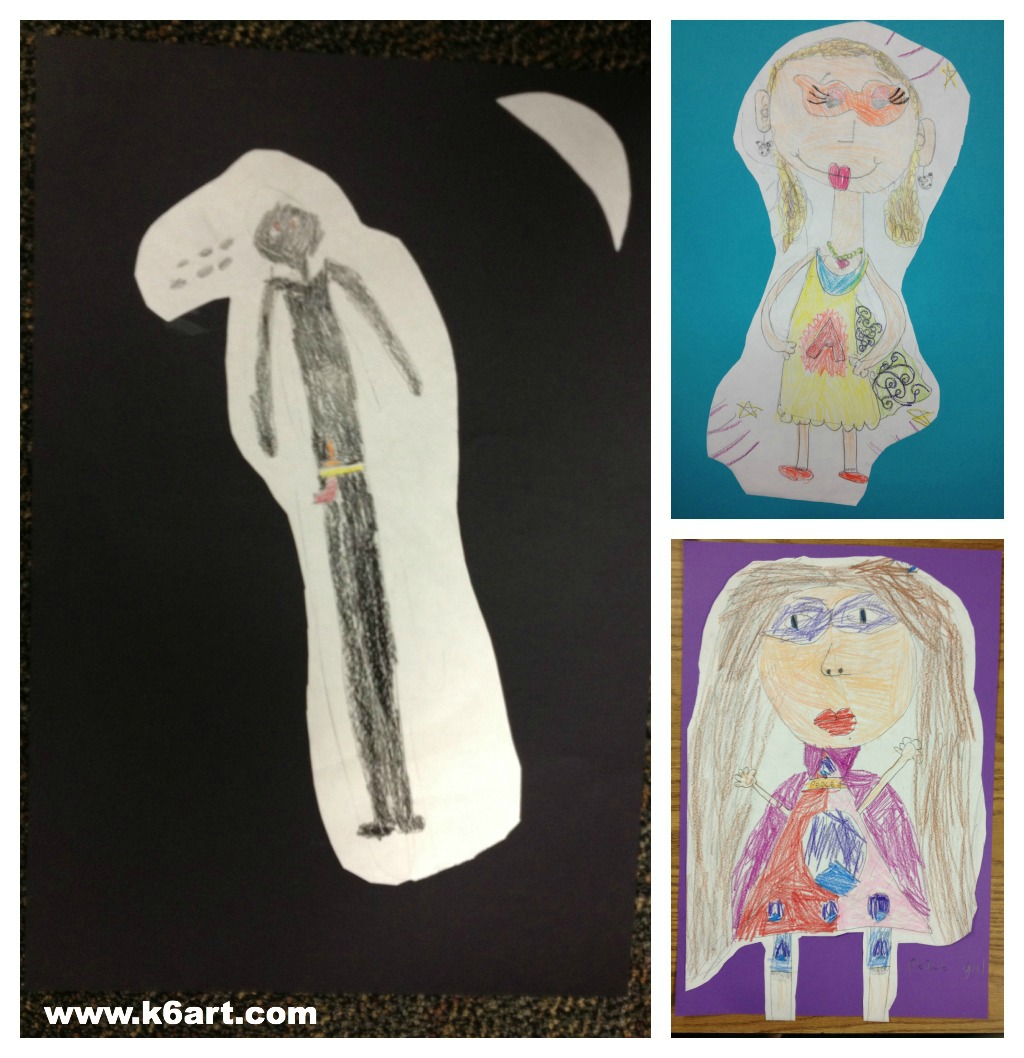
The students brainstormed. They invented new super heroes that swam underwater with sharks or saved horses. Some had magic arrows or swords, some had super dog (or cat) side-kicks. Overall, the students were HIGHLY engaged. This was a home run hit and I will definitely teach again next year!

This lesson was inspired Marnie Hyland’s photos on Art Education 2.0, via Pinterest.

Second grade results:

superhero collage

superhero self portrait 2

Do you have a special twist on a self-portrait project?

Colorful Landscape Name Art

Fourth graders use markers to make landscape name art. Allow two 40-minute sessions.


Looking for quick,  fun name art project? Here is the colorful project that gives 100% success and lets you get to know your students.

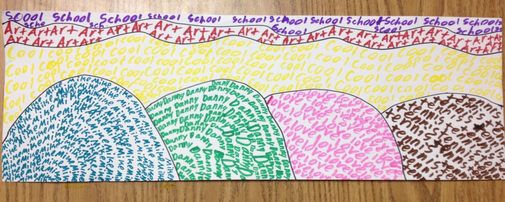
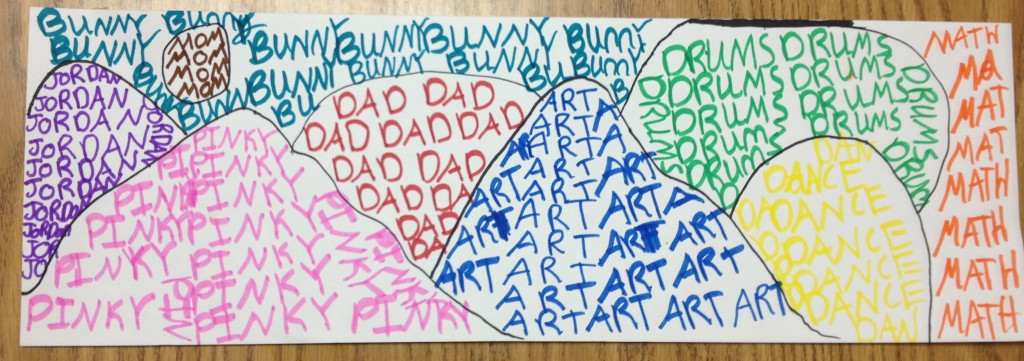
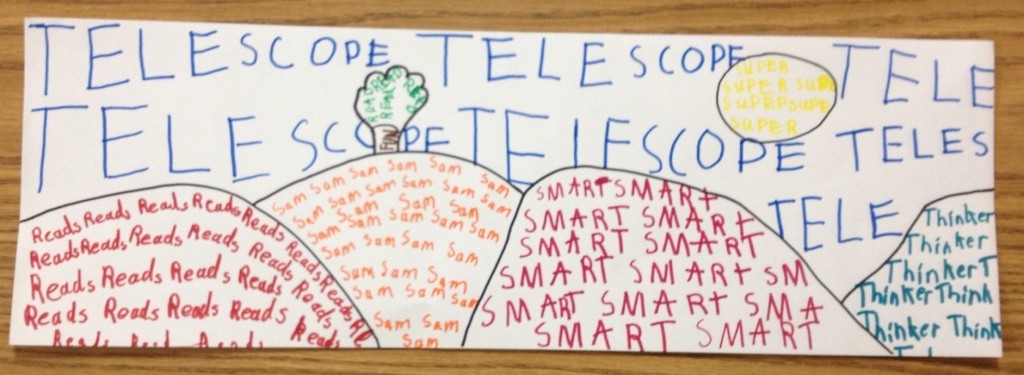
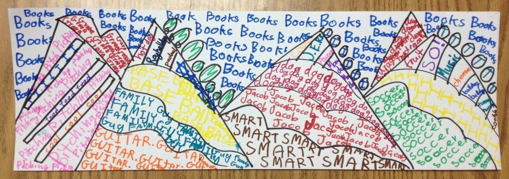
Students made a simple landscapes using curved lines. Each section was filled with a single repeated word. One section had to filled with the student’s name; the other sections had to be filled with single repeated words that described the student in some way. Students incorporated their pets, favorite subjects (yay art!), sports, activities, family members and favorite foods.

Jordan included her dog, Pinky, in her name art.

Sam likes telescopes.


I love how Jacob personalized his landscape.

This lesson is adapted from this landscape lesson plan on the Arteascoula blog (via Deep Space Sparkle).


P.S. I love name art!  I started a name art board on Pinterest to help plan our fall name art unit.

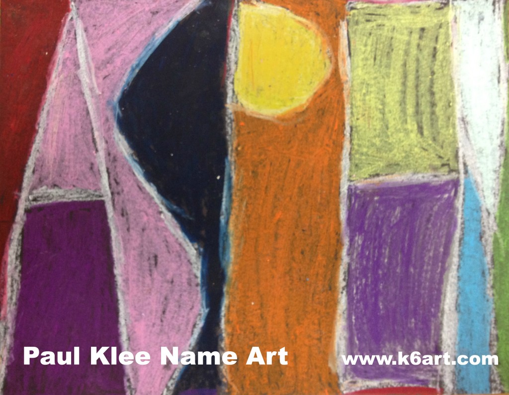
Paul Klee Name Art

Looking for an exciting name art project? How about introducing a famous artist at the same time? Try this Paul Klee-inspired graphic name art project.

Second graders create name art in the style of Paul Klee. Allow 1-2 40 minute classes. Artwork by Tyler.

Start out by introducing artworks by Paul Klee. This project is inspired by his graphic works such as Castle and SunWikiPaintings has lots of images of his art. Click here,  herehere, and here to see some of Klee’s other graphic artworks. This is a good time to talk about abstract art.

Materials:

  • Black construction paper, 11″x14″
  • pencils and erasers
  • Oil Pastels (including white)

Students should turn their paper horizontally. They write their names in pencil, using all capital letters. Encourage students to S-T-R-E-T-C-H their letters from the bottom to the top of the paper (note: students with long names may need to draw extra skinny letters, use longer paper, or perhaps use their nicknames).  The letters can touch the left and right sides of the paper AND touch each other: letters such as ‘E’, ‘F’ and ‘K’ look more abstract when drawn in this manner.

After they are pleased with the layout, they trace over their pencil lines in white oil pastel.

Students write their name in white oil pastel, then fill in the spaces with colored pastels.

Next they color in the spaces in their name. Encourage them to use a variety of colors, although it is fine to repeat colors. Students must not color in with black pastels.

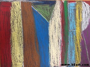
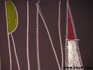
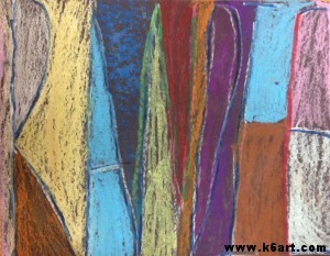
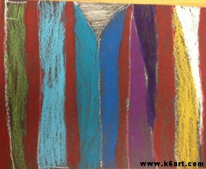
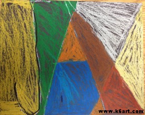
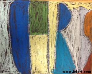
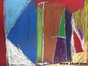
Completed second grade art:

Randie

Flynn

Jax


Chris

Kian

Show students the completed projects and ask if they can read the artist’s name. Successful artworks are often abstracted to the point it is challenging to see the artist’s name! How does this compare to Klee’s graphic artworks?

This lesson plan was inspired by (or abstracted from!) this fabulous post on the Kids Artists blog.

Enjoy!

Do you have a favorite name art lesson plan for the beginning of the year?


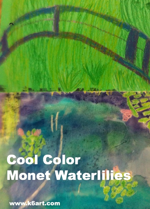
Cool Color Monet Water Lilies

cool color monet waterlilies

Second grade is studying the cool colors.  After watching the excellent elementary color theory DVD Getting to Know Color in Art  we looked at photos of Monet’s beautiful garden and pond in Giverny, France. Students could imagine themselves at the pond on a summer day, feeling the willows sway, listening to frogs as they rested on the lily pads, resting in the cool shade, even floating in Monsieur Monet’s ‘art boat’ as it passed under the Japanese bridge.

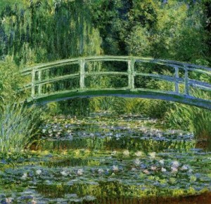
“Le Bassin aux nymphéas” 1899. One Monet’s many water-lily paintings.

We looked at several of Monet’s waterlily paintings, focusing on his use of cool colors and short, quick strokes of paint. You can download my Powerpoint of Monet’s garden here.

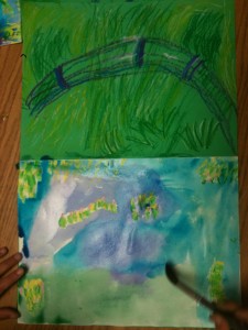
We then created an oil pastel and watercolor art work.

Allow three 40-minute sessions for this project.

Materials:

  • 12×18 construction green construction paper
  • 9×12 watercolor paper
  • glue sticks
  • oil pastels in blues, greens, and purples plus white, yellow and pink
  • watercolors in blue, green and purple
  • kosher salt (optional)

Discuss Monet’s art, his pond and garden. Review cool colors. View powerpoint or photos of Monet’s garden.

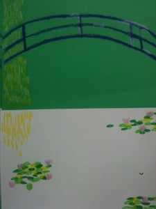
Fold green construction paper ‘hamburger’ (the short way). Glue watercolor paper to lower half of green paper.

Students use oil pastel to draw bridge, water lilies and foliage.

Review painting of pond and Japanese bridge.

Oil Pastel:

Using oil purple and blue oil pastels, draw three arcs (‘rainbows’) for the Japanese bridge. Add some vertical lines to the bridge to finish. Blend and highlight with white oil pastels.

Review photos of water lilies.

Using various green and yellow oil pastels, draw clusters of lily pads on the watercolor paper. The lily pads don’t have to be perfect – just ovals or quick strokes of pastel. They should overlap a bit. Add a few pink lily flowers, highlight with white.

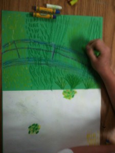
Fill the entire top half of the green paper with foliage in greens and yellow. Use short strokes. Add a downward cascade of short lines for the weeping willow.  Tell kids to ‘go behind’ the Japanese bridge.

Use short strokes of oil pastel to completely fill the green paper with foliage.

Painting:

Using the cool colors (blue, green and purple), paint the watercolor paper using long horizontal strokes.  Colors can overlap and blend.  Go right over the oil pastel lily pads.

Use purple, blue and green watercolors on the lower half of artwork

Students may add a small pinch of Kosher salt to the wet watercolor. The salt absorbs a bit of color and an additional dimension to the pond. Brush off salt when dry.

Wow!!! This project was a hit! We learned about a famous artist, reinforced color theory, experienced the joy of painting on watercolor paper and blending pastels. All kids were very proud of their artwork. Success!


Enjoy!


(Note: post updated 12/22/13)

Related Posts Plugin for WordPress, Blogger...